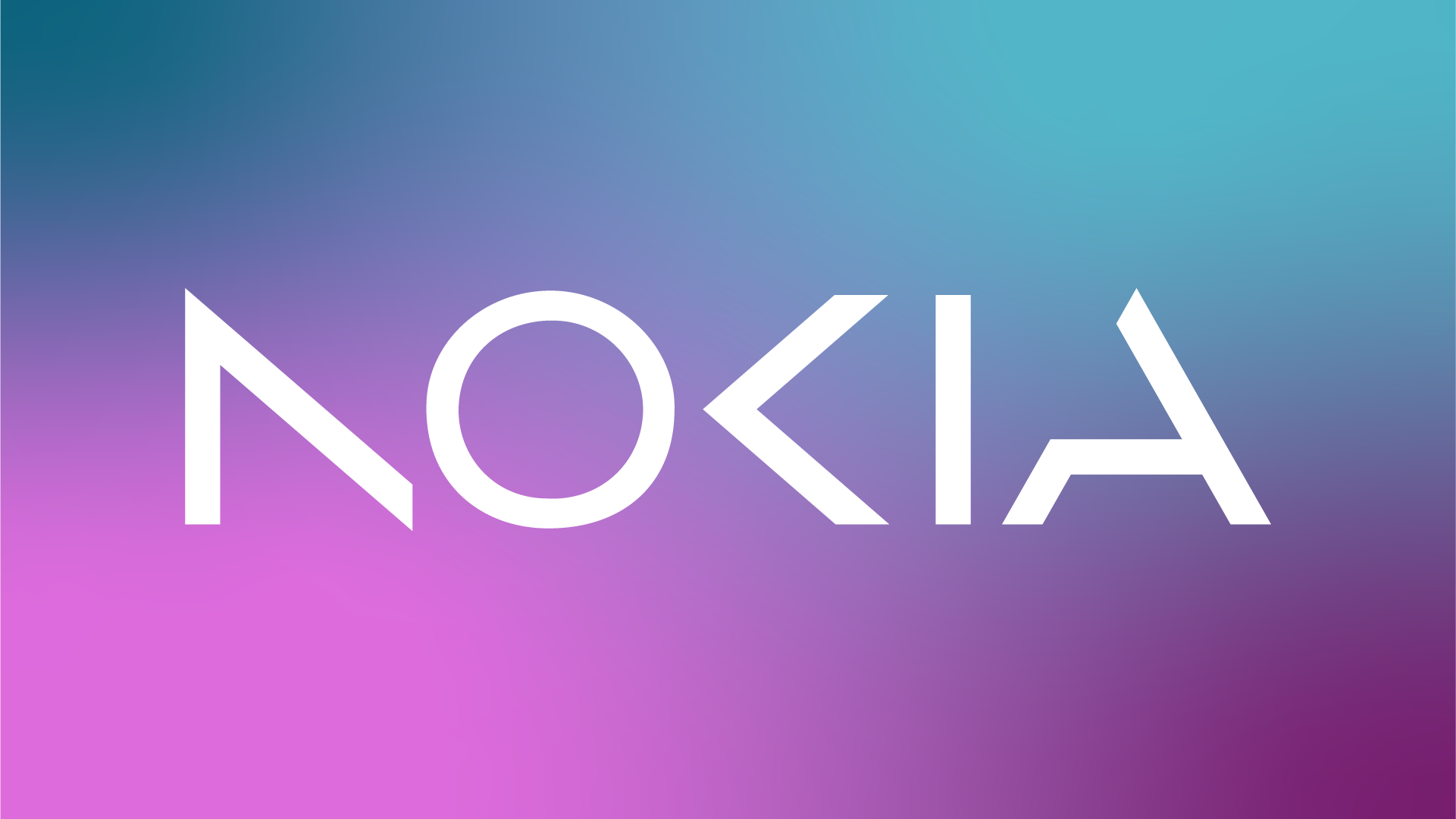
Nokia Logo Redesign
Was it worth it?
When creating a wordmark or lettermark, it can be an effective approach to simplify the design if the logotype consists of only 2-5 letters and is easily recognizable and pronounced. This can be achieved by eliminating unnecessary lines and utilizing negative space and simpler shapes to create a visually cleaner and more memorable version of the logo. Numerous companies, including CNN, HP, KIA, and more recently Nokia, have implemented this strategy to great effect.
Some people are going all critical on the new Nokia logo, but honestly, the designers probably made those "mistakes" on purpose. They likely did a ton of user-testing to ensure that the logo would be versatile, visually balanced, and, you know, actually effective.
Besides, people often forget that good typography isn't just about being geometrically perfect - it's about looking visually aligned and proportional. Take the Google logo, for instance. The "G" isn't a perfect circle, but it still looks like one thanks to some expert designer tweaks. So let's cut Nokia some slack and appreciate the work that went into their new logo!
Also, you want your logo to be more visually striking, memorable, and interesting than just regular typed out words. That way, people will be able to easily recognize it and remember your brand.
Written by Onindo Ahmed


